
Designing trust into the Meridial Expert Marketplace
I rebuilt the public website so prospective Experts could trust it enough to apply, then connected it to product sign-up.
Role
Sole designer (product + growth)
What I owned
Research, information architecture, visual system, end-to-end page design, component system, and website-to-product handoff
Timeline
April to June 2026
Partnered with
Meridial product designer on the sign-up handoff







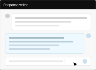
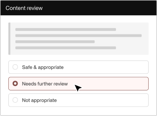
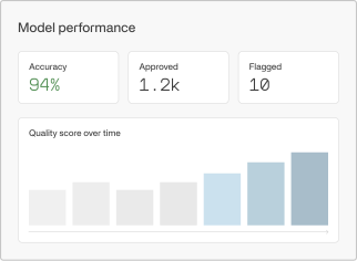










At a glance
Meridial is Invisible Technologies’ expert network for AI training work. Over three months I rebuilt its public website so prospective Experts could trust it enough to apply. The work included a clearer identity, stronger trust signals, a continuous path into the product, and a flexible component system that Marketing and Hiring could scale.
Problem
Meridial was scaling Expert hiring for AI training campaigns and Marketing set a target of 500% more sign-ups. The website was every candidate’s first touchpoint and was losing them within two pages. Public reviews carried a 1.8 TrustScore from before the rebrand. The target couldn’t be met without rebuilding that trust. I had designed the original site. The data showed it wasn’t working, so the redesign started with an audit of my own work.
A heuristic audit of the old homepage
Every problem came back to the same thing: the site gave candidates no reason to trust it.

1
Vague value proposition
“Shape the future of AI” never explained what Meridial is or why an Expert should join.
2
Misleading primary CTA
“Join the network” routed to /projects, not sign-up.
3
No proof the company is real.
no client logos, compliance signals, or recognizable labs above the fold.
4
Flat hierarchy
Cards for benefits, projects, and testimonials all looked the same.
Research
I looked at Meridial the way an Expert would, through an applicant interview, public reviews, analytics, a homepage audit, and a competitive scan. Three issues kept showing up:

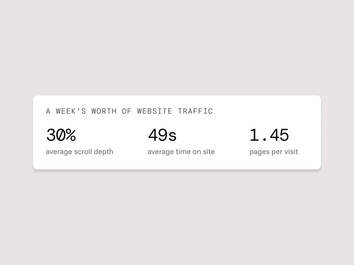

Those findings shaped a new sitemap: add pages where trust was missing and redesign where engagement was low.

Alignment
Mapping the end-to-end journey revealed two disconnected hiring systems. Project cards routed candidates out to Greenhouse (which the company planned to retire), while other paths led into product sign-up. I partnered with the Meridial product designer to align every entry point into the product so the handoff would hold once Greenhouse was gone.


Key decisions and trade-offs
Three decisions shaped how the trust signals, pages, and system fit together.

Blend both brands into one identity
I paired Invisible’s palette with the product’s components and used Figma Weave to create imagery of professionals so candidates could see themselves in the role.
Trade-off: Not a pure copy of either brand. The blend is what makes the website and sign-up feel like one continuous place.
Consolidate eight domain pages into one interactive component
“AI training” means little until an Expert can see where they fit. I built an interactive component showing the eight domains we recruit for, used on the home and Become an Expert pages.
Trade-off: Hiring shifted from specialists to generalists, so the specialized pages were cut in favor of one overview.

Build with flexible components so the team could run the site without a designer
I traded custom layouts for a system Marketing and Hiring could update and scale for campaigns. Legal was still approving what we could say publicly, so I made every card and layout flexible for text and icon edits rather than locking anything down.
Trade-off: Fewer custom page layouts in exchange for faster updates. Legal’s later edits went live without a single layout change.
Final design
A front door rebuilt around trust: proof on every page, a clear path from first click to sign-up, and one visual system spanning website and product.
Clearer value proposition, trust signals (scale, labs, completed tasks) above the fold, and a primary path that leads toward joining.

Paths into the product
Two flows that keep context and reduce uncertainty once someone decides to engage.
Joining the network
Nav and CTAs across the site lead to one general sign-up. The page pairs the website’s branding and proof points with the product’s sign-up card, so joining feels like staying in one place rather than leaving for something else.




 Continue with Google
 Continue with LinkedIn
Applying to a project
Project cards open the full role details, with the Apply card pinned beside them as you read. Applying carries those details into the product’s sign-up so they stay in view across the handoff.
 Search projects by keyword



 12+
Projects page
Rebuilt so project cards match the product and read distinctly from other card types. “Featured” became a tag. Applying now carries the role details into sign-up.

New trust pages
About answers “is this real?” with Invisible’s Expert Network, the labs, and the scale. Become an Expert covers what the work pays, who qualifies, and how to start.


Outcome
The site is now live and shipped largely as designed. The component system and website-to-product handoff held up under Legal review, so the team could scale campaigns without further layout changes. I left the company shortly before public launch, so I didn’t see the live numbers. These are the benchmarks I would have tracked.
Post-launch benchmarks
" transform="translate(3.833 31.33)" width="29.333350000000003px"/><path d="M 0.558 10.137 C 0.19 9.248 0 8.294 0 7.331 C 0 5.387 0.772 3.522 2.147 2.147 C 3.522 0.772 5.387 0 7.332 0 C 9.276 0 11.141 0.772 12.516 2.147 C 13.891 3.522 14.663 5.387 14.663 7.331 C 14.663 8.294 14.473 9.248 14.105 10.137 C 13.736 11.027 13.196 11.835 12.516 12.516 C 11.835 13.197 11.027 13.736 10.137 14.105 C 9.248 14.473 8.294 14.663 7.332 14.663 C 6.369 14.663 5.415 14.473 4.526 14.105 C 3.636 13.736 2.828 13.197 2.147 12.516 C 1.466 11.835 0.927 11.027 0.558 10.137 Z" fill="transparent" height="14.663px" id="pEVCSiLLJ" stroke-dasharray="" stroke-linecap="butt" stroke-linejoin="miter" stroke-miterlimit="10" stroke-width="4" stroke="rgb(10, 10, 10)" transform="translate(11.168 11.166)" width="14.662999999999998px"/><path d="M 0 0 C 9.778 0 14.667 4.191 14.667 4.191 L 14.667 11 L 8.25 11" fill="transparent" height="11px" id="riQe_kEHD" stroke-dasharray="" stroke-linecap="butt" stroke-linejoin="miter" stroke-miterlimit="10" stroke-width="4" stroke="rgb(10, 10, 10)" transform="translate(29.5 25.832)" width="14.666699999999999px"/><path d="M 5.5 14.664 C 9.549 14.664 12.832 11.381 12.832 7.332 C 12.832 3.283 9.549 0 5.5 0 C 3.309 0 1.343 0.961 0 2.483" fill="transparent" height="14.66358px" id="hFaFusU01" stroke-dasharray="" stroke-linecap="butt" stroke-linejoin="miter" stroke-miterlimit="10" stroke-width="4" stroke="rgb(10, 10, 10)" transform="translate(24 5.666)" width="12.831899999999997px"/></svg>)
" transform="translate(24 20.334)" width="1px"/><path d="M 0 0 L 0 5.5" fill="transparent" height="5.500000000000002px" id="m5HJgb5__" stroke-dasharray="" stroke-linecap="butt" stroke-linejoin="miter" stroke-miterlimit="10" stroke-width="4" stroke="rgb(10, 10, 10)" transform="translate(24 11.164)" width="1px"/><path d="M 0 0 L 0 5.5" fill="transparent" height="5.5px" id="OZKUBYvv6" stroke-dasharray="" stroke-linecap="butt" stroke-linejoin="miter" stroke-miterlimit="10" stroke-width="4" stroke="rgb(10, 10, 10)" transform="translate(24 2)" width="1px"/><path d="M 0 0 L 14.667 14.667 L 29.333 0" fill="transparent" height="14.666700000000002px" id="VBR4EcmwC" stroke-dasharray="" stroke-linecap="butt" stroke-linejoin="miter" stroke-miterlimit="10" stroke-width="4" stroke="rgb(10, 10, 10)" transform="translate(9.334 28.584)" width="29.3333px"/></svg>)
" transform="translate(5.667 5.666)" width="32.99995px"/><path d="M 33 0 L 0 0" fill="transparent" height="1px" id="taWFYCiCx" stroke-dasharray="" stroke-linecap="butt" stroke-linejoin="miter" stroke-miterlimit="10" stroke-width="4" stroke="rgb(10, 10, 10)" transform="translate(5.667 13)" width="32.99995px"/><path d="M 25.667 0 L 0 0 L 0 18.333 L 25.667 18.333 Z" fill="transparent" height="18.3333px" id="p8F4FmbXT" stroke-dasharray="" stroke-linecap="butt" stroke-linejoin="miter" stroke-miterlimit="10" stroke-width="4" stroke="rgb(10, 10, 10)" transform="translate(16.667 24)" width="25.6667px"/><path d="M 25.667 0 L 0 0" fill="transparent" height="1px" id="qweYUKcxL" stroke-dasharray="" stroke-linecap="butt" stroke-linejoin="miter" stroke-miterlimit="10" stroke-width="4" stroke="rgb(10, 10, 10)" transform="translate(16.667 31.334)" width="25.6667px"/></svg>)
Reflection
What I’d carry forward
A website can signal trust; only the product can keep it.
The redesign addressed the credibility gap on the marketing site and created a continuous path into sign-up. The next step would have been interviewing new Experts to see whether the redesign changed how credible Meridial felt once they were inside the product.
Prototype in code to close the design-to-dev gap.
QA took multiple rounds to match the spec. Next time I would hand Development a working prototype. I later rebuilt the site in Replit, which confirmed how much tighter the handoff could have been with a coded reference.
